This logo was created as an exercise for an endangered species awareness campaign. I really wanted to utilize negative space to have a visual representation of the species disappearing but still hanging on. The secondary logo was a play on the Black Spider Monkey’s name by incorporating key features of a spider and a monkey.

GreenLight Co. is a concept for a vegan fast food chain. I wanted the logo to resemble a stoplight to represent the “on the go” nature of fast food but have the lights only be green because of the company name and its plant based products. I decided to go with simple line work to put an emphasis on the simple ingredients being used within the business.

Logo design for a New York based skateboard company with a space theme. I wanted to really capitalize on NY street culture by incorporating a handwritten graffiti style typeface. It was also crucial that the design could be displayed effectively without color while maintaining planetary resemblance.

Logo designed for a golf themed sub restaurant, modeling various colorways and merchandise mockups. I wanted both the product and the theme to be heavily represented in the design especially because it's such a peculiar combination. To keep the design playful and welcoming, I incorporated the club into the lettering and arranged the colors to resemble sandwich fillings.

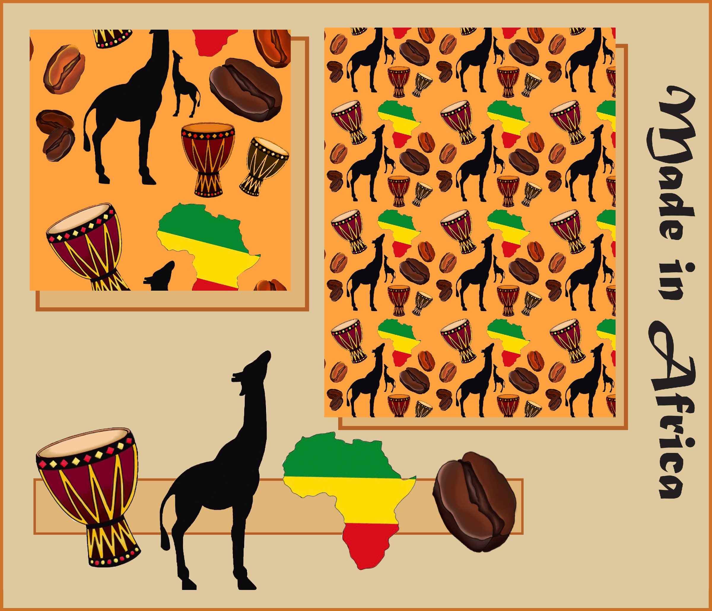
Pattern design made using icons representing various African cultures. When workshopping this pattern, clothing and fabric came to mind. I wanted to keep the icons simple so the design wasn't too cluttered but make sure each icon was still identifiable even if warped on clothing.
